NASA+
UX DESIGN
RESEARCH
INTERACTION
Specifications
Role: UX Research Lead
Team:
Suji Kim, Team Lead, UI Design
Lara Kurt, UI Design Lead
Lukas Wiesner, UX Research
Julian Salinas, UI Design
Duration: 10 Weeks
Tools: Figma, Illustrator, Qualtrics, After Effect, Rotato
Why
Whenever the media mention about NASA, they always talk about their old glory in 1970s, but they do not talk about the great technology that NASA is developing currently.
How
Leverage the extensive amount of data and stories to inspire the future generation to be exposed to science and technology.
What
An educational platform, showcasing the video and activity contents to experience how fascinating the space, and how sciences are applied.
Setting
Topic
Identify a brand that needs help, it may be a brand that was once a great brand and fell off, or it is still a good brand, but has a clear opportunity for growth and/or innovation.
Setting
Assumption
“I see NASA only on a T-shirt these days.”
The team realized that there are many NASA logos in different places; however, NASA's activities have been relatively quiet for a long time. For someone who grew up inspired by space exploration, NASA was a perfect brand for this topic.
Research
Survey
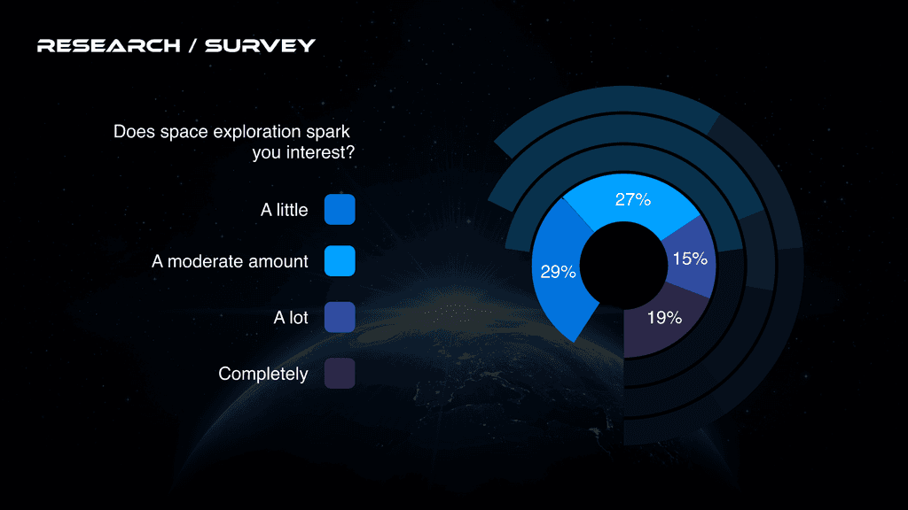
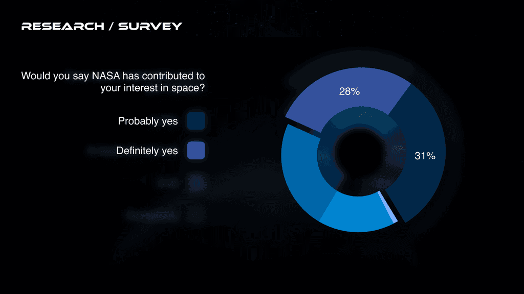
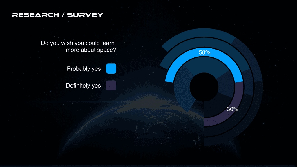
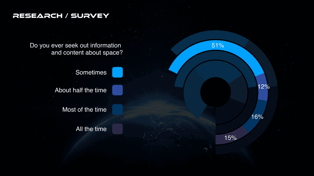
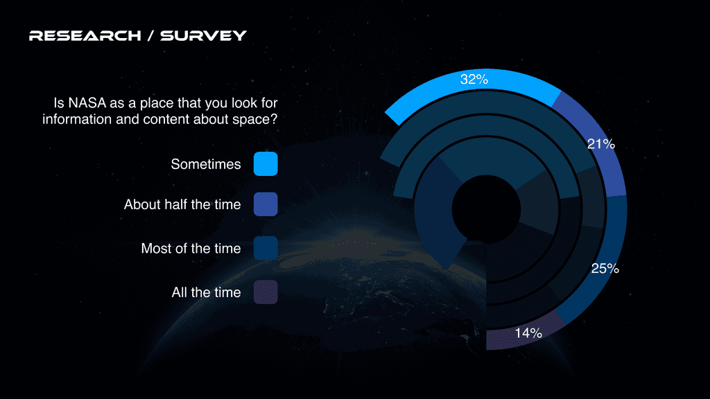
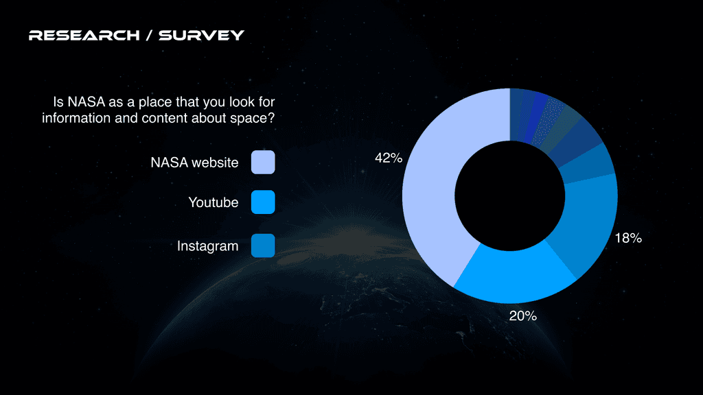
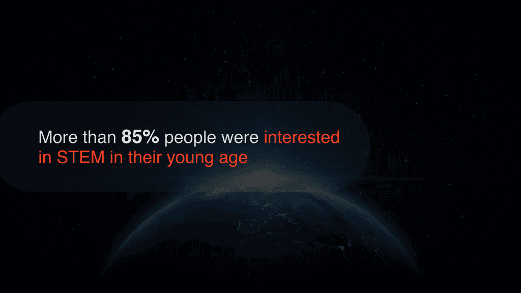
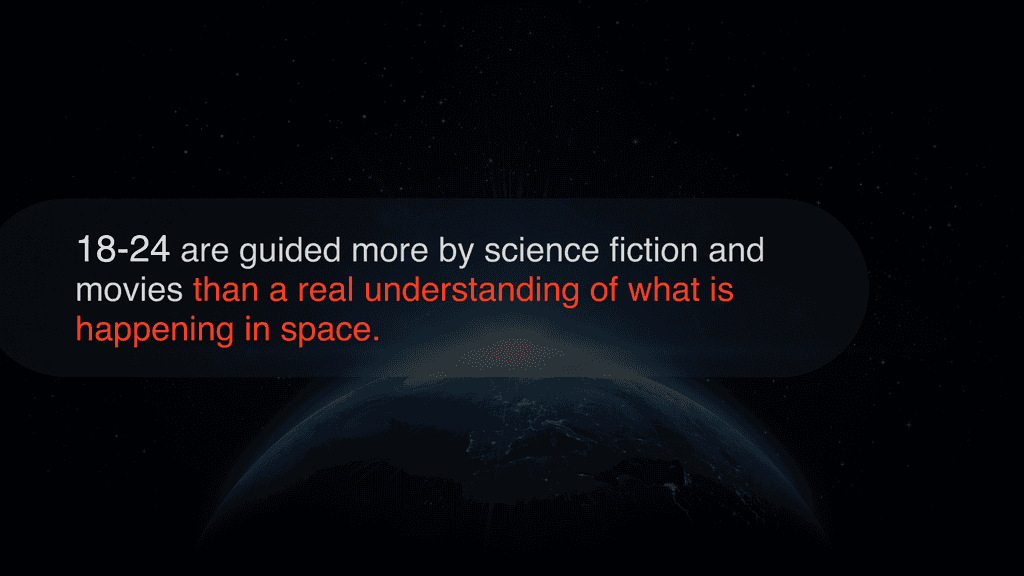
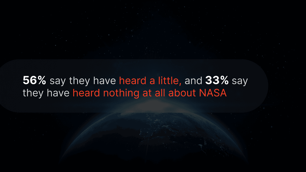
We first needed to validate our assumption by asking a wide range of people. We asked from 18 years old students to 65+ people who grew up watching what NASA has done. In addition, we wanted to know how much people are interested in learning space and science.
Research
Secondary Research
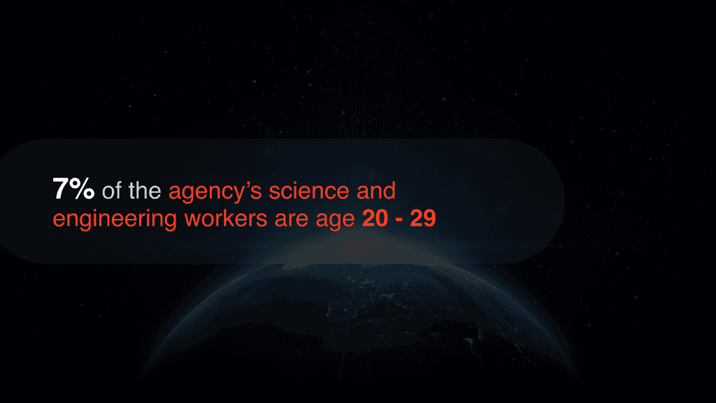
As we asked people about NASA and their interest in learning the space and science, we also took a look for an information about the reputation of science among the Gen Z, current situation in STEM field, demographic of the NASA
Research
Expert Interviews

Reggie Martin
Chief of Branch Control Division at NASA Kennedy Space Center

Tae-jin Chang
Senior Researcher at Korea Aerospace Research Institute

Nathan
Meteorologist Student in College
We queried the experts regarding their scientific career motivations, NASA's influence on their choices, and their views on NASA's public outreach effectiveness.
Here are some quotes from the experts.
Target Audience
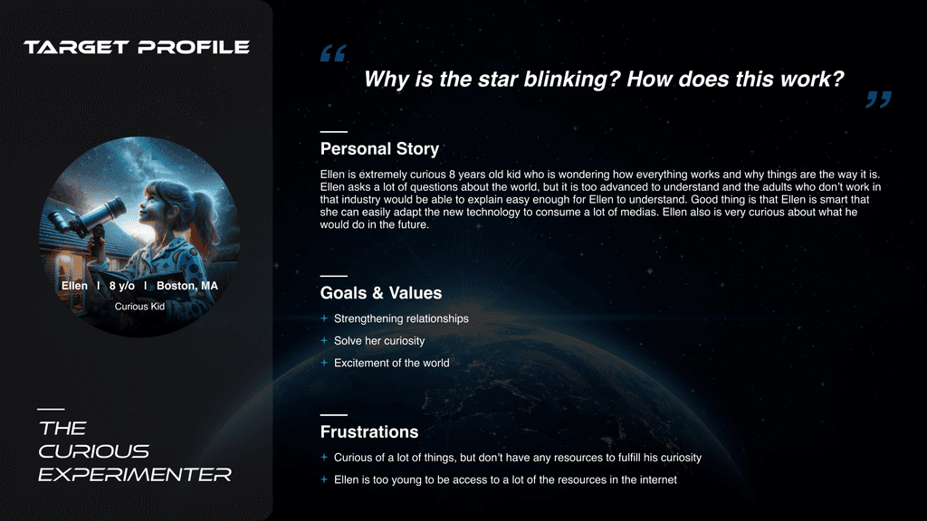
Persona
As it was mentioned, we targeted the future generation, specifically age 7 - 11 years old, an age that they start to think about their dream when they grow up. We wanted to inspire the option for the future.
Target Audience
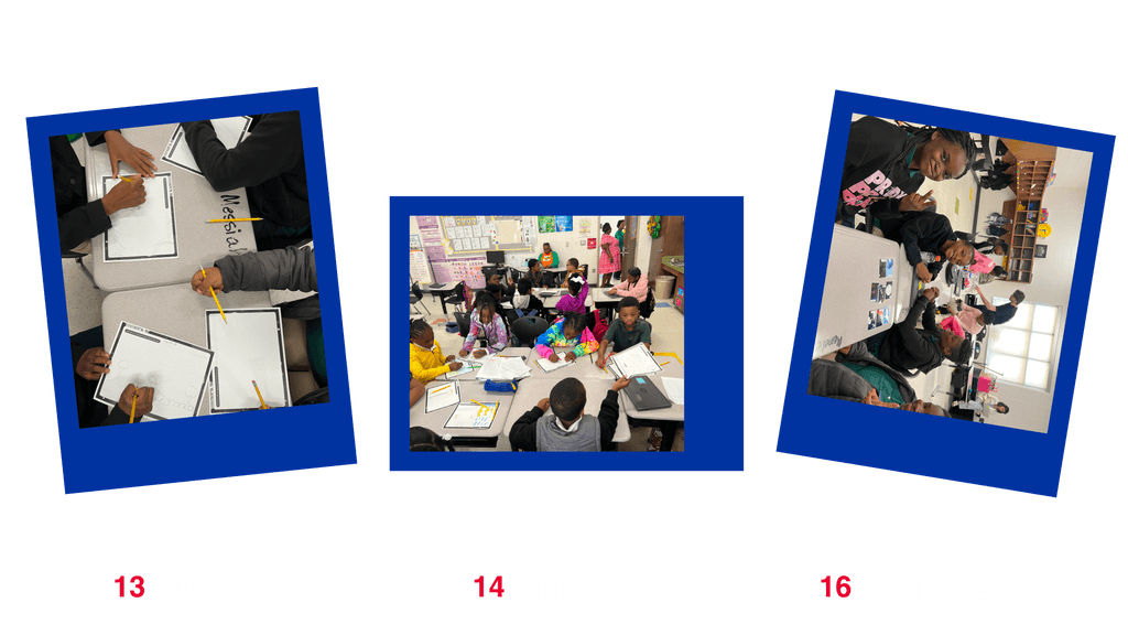
Activities with students
'Perseverance,' the name of the Mars rover got its name through the student contest that NASA conducted. This inspired us to go to one of the elementary school, and design the platform together.
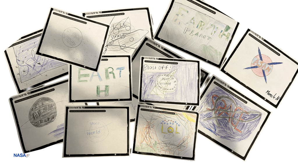
As we did an exercise, we noticed following three insights.
To go in detail about the drawing 'relatable pictures,' we noticed that majority of the students used purple to associate space and green to associated Earth.
Design Development
NASA+ Cycle
The cycle illustrates the 3 main contents. A NASA+ content, a STEM Learning, then these two will be tied closely with Cosmo AI.
Design Development
Lo-Fi
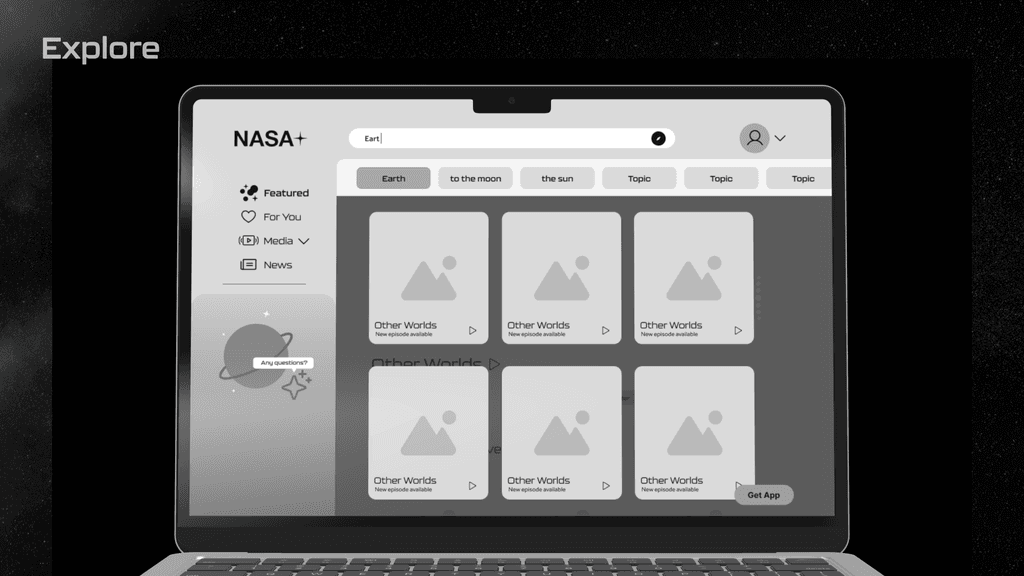
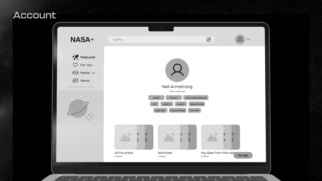
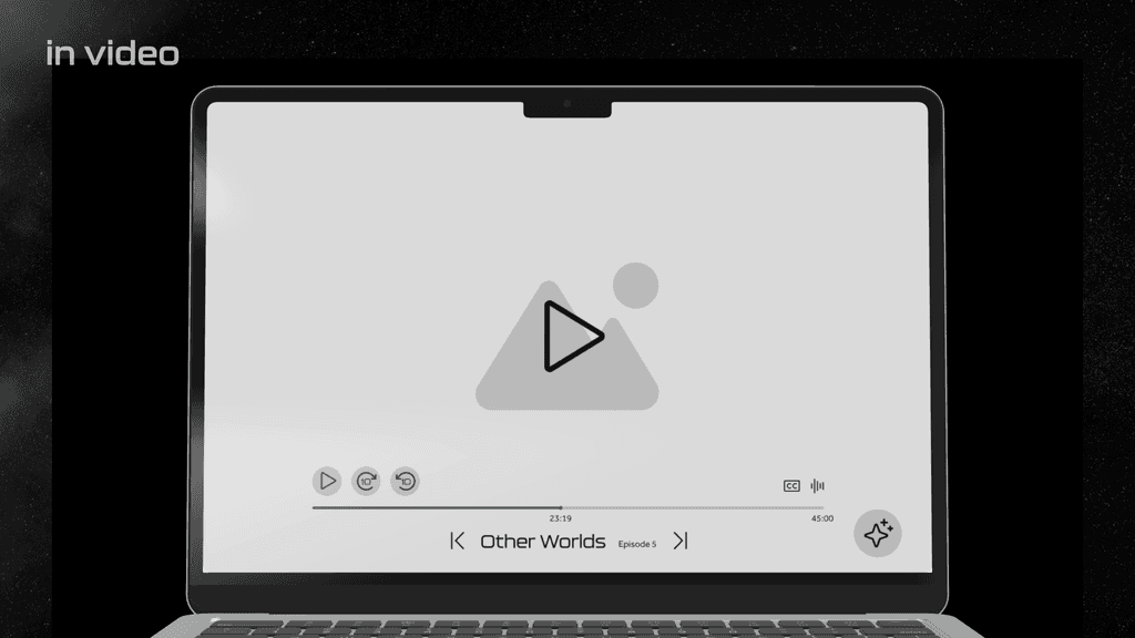
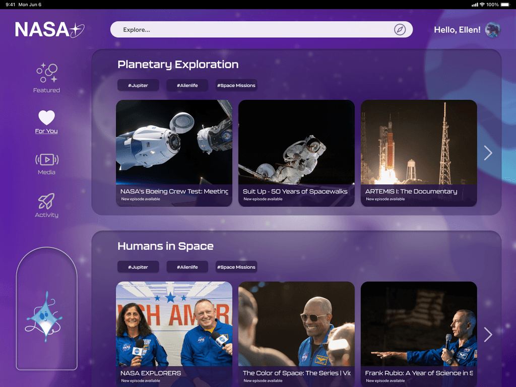
Architected the big and bold content boxes, giving the emphasis on the visuals of the content. We also used intuitive buttons and arrows, making the directions clear for the users.
Design Development
Design System Exploration
Going back to the insights we gathered from the children in elementary school, we developed two versions; Green and purple. The decision will be made after the A/B testing.
Design Development
Mid-Fi
Focused on the interactive button and clear direction indicator. We also prioritized UX writing appropriate for children.
Validation
User Testing
We went back to same elementary school, asked the same group of students of how our product developed. The students were able to give us more practical and honest feedback because they were familiar with us.
Validation
A/B testing
We also took a trip to Forsyth park seeking to interview parents and get their perspective of this platform. We conducted the A/B testing of two versions, as well as asking questions to understand the willingness of create the account for their child or children.
As a final design, we chose purple over green, because majority of the testers said purple is more relatable with the space. We also added more space related graphics to help students to be more engaged.
Final Design
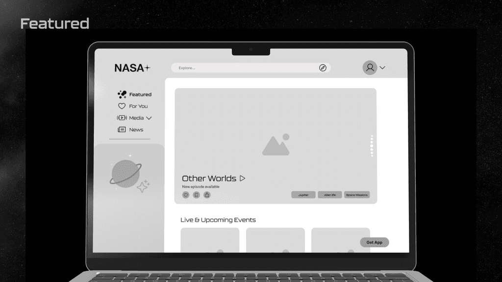
Featured
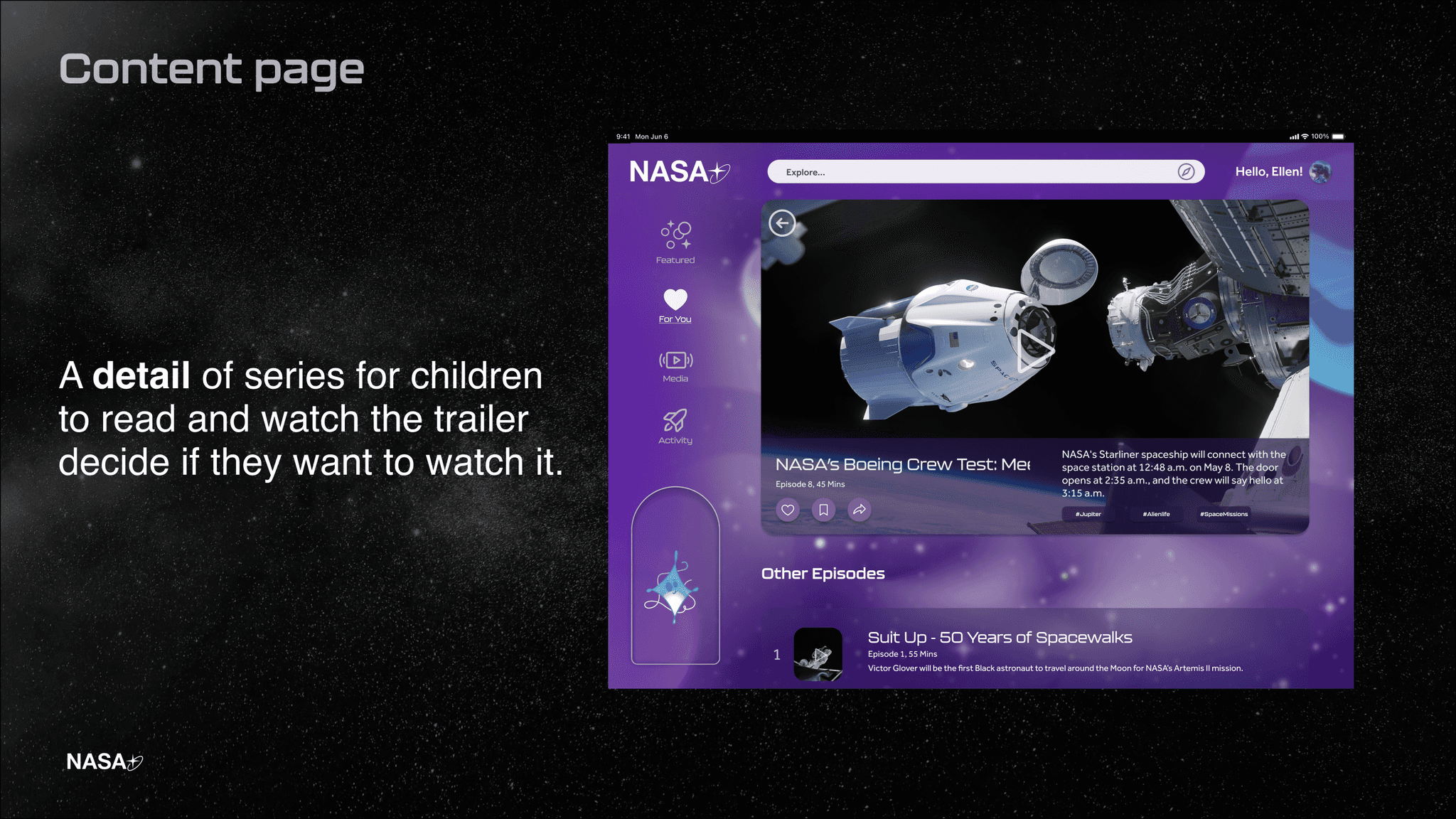
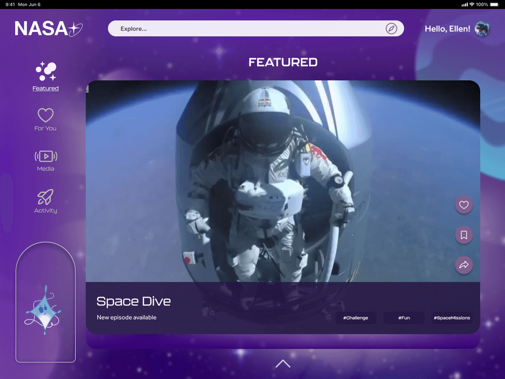
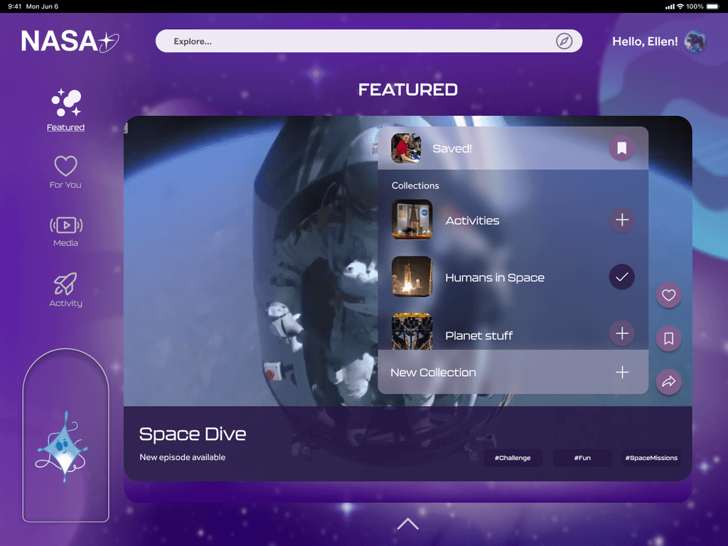
A first page, showcase the big visual of the content, slide up and down style, suggested with the new content from NASA.
Final Design
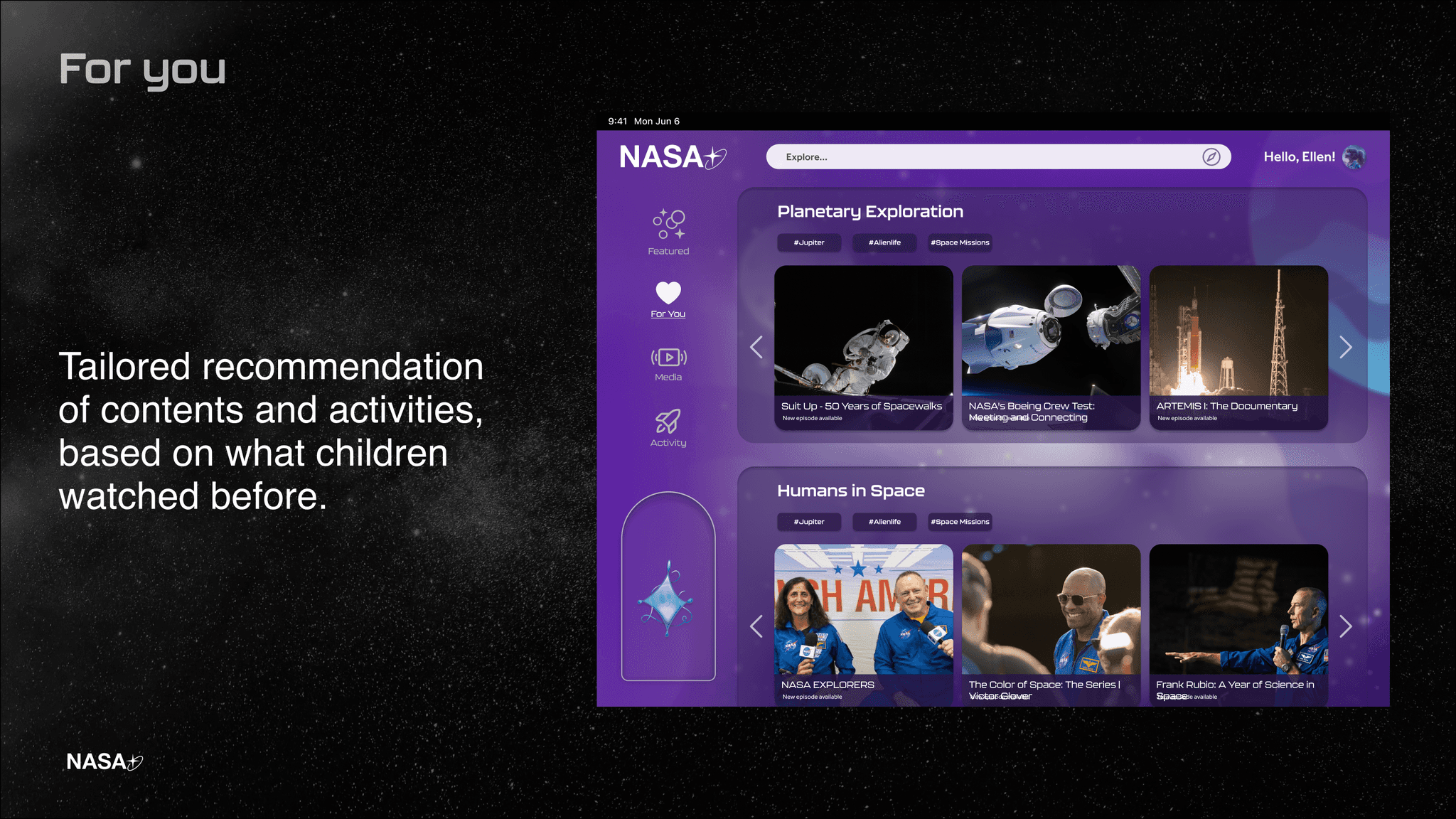
For You
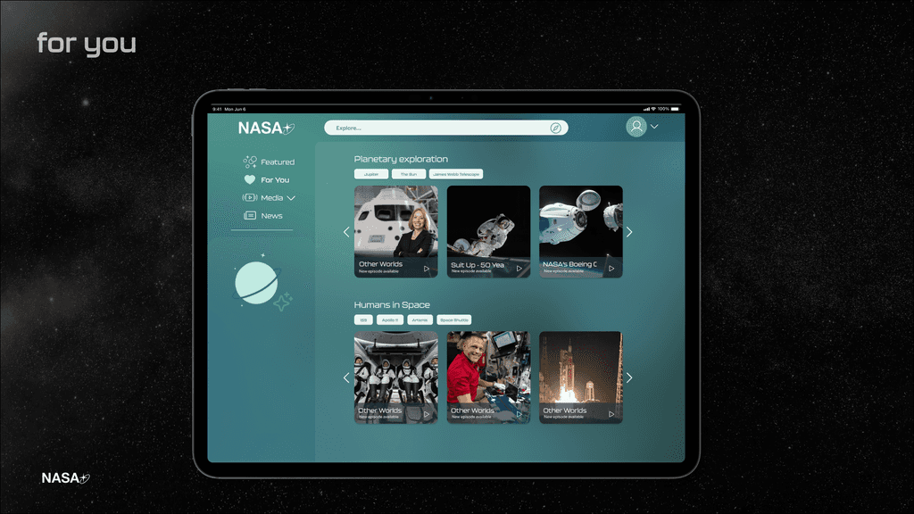
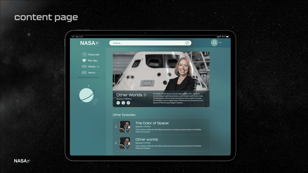
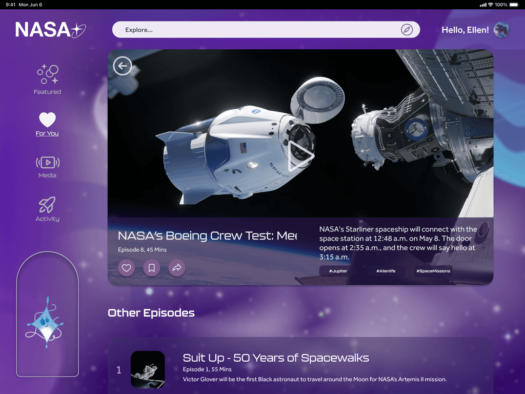
A suggested contents based on the user's preference. This will help users to be exposed to new contents that is related to the videos that users have watched.
Final Design
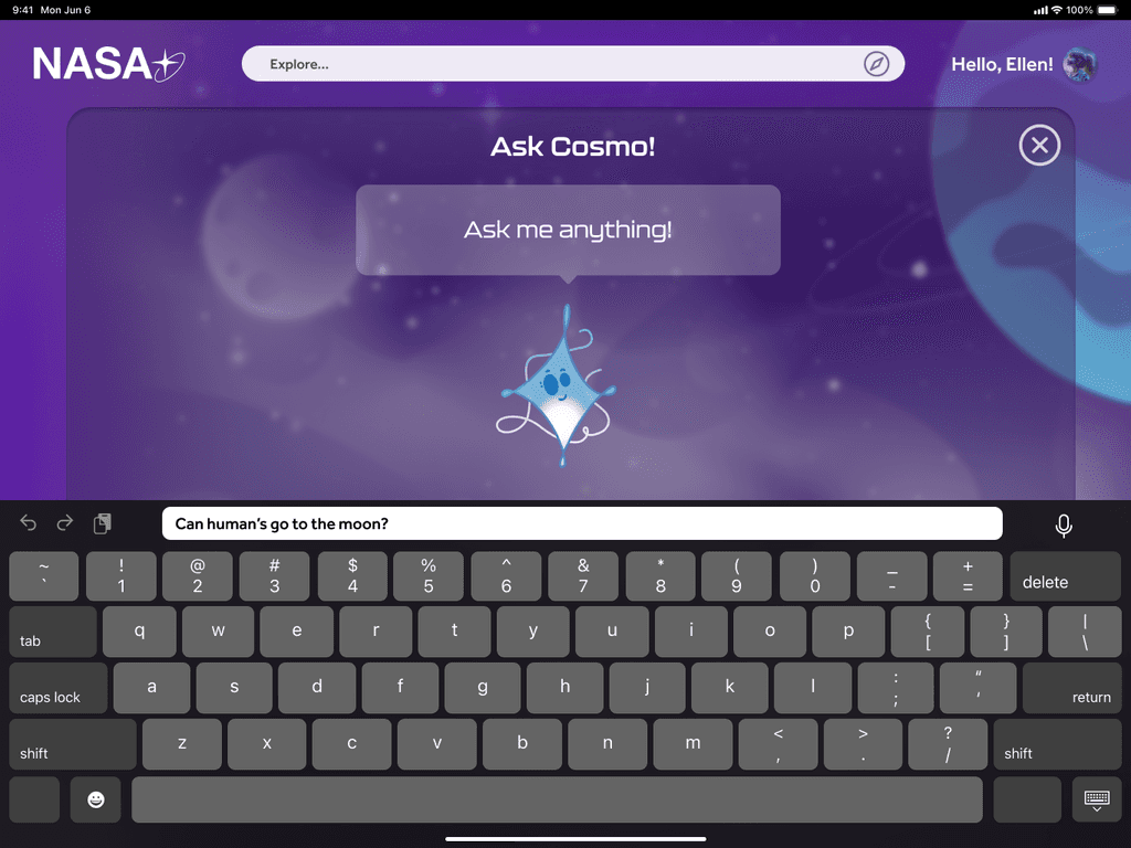
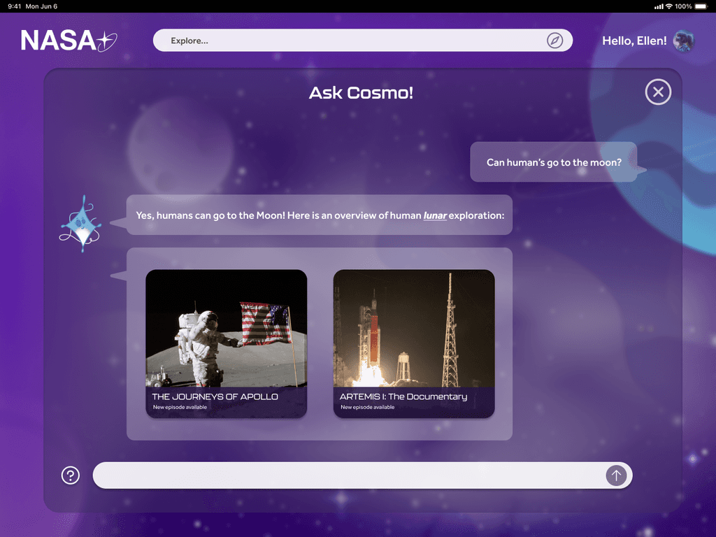
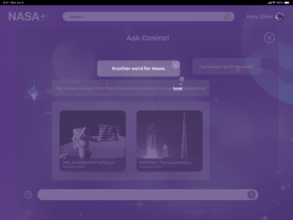
Cosmo AI
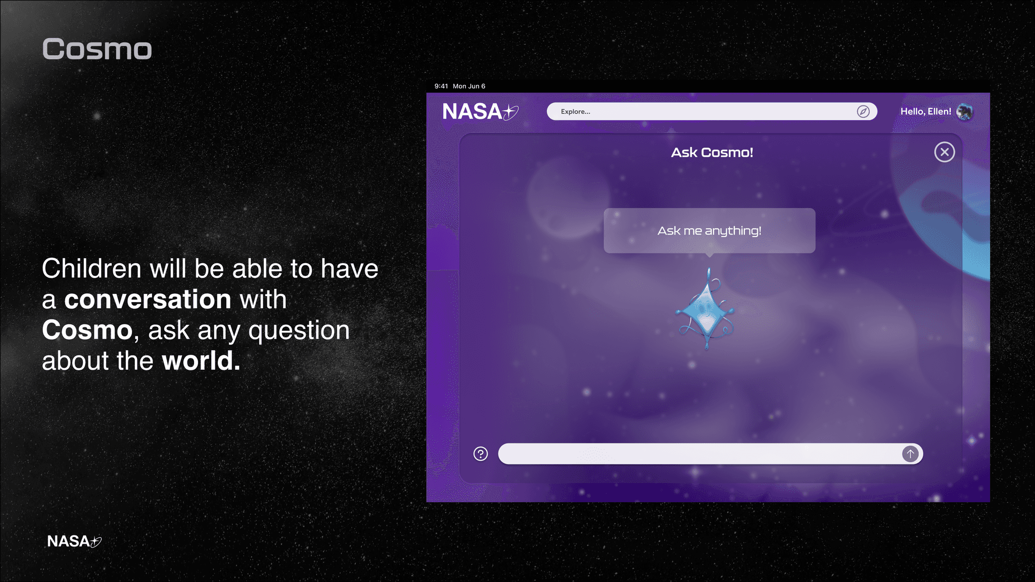
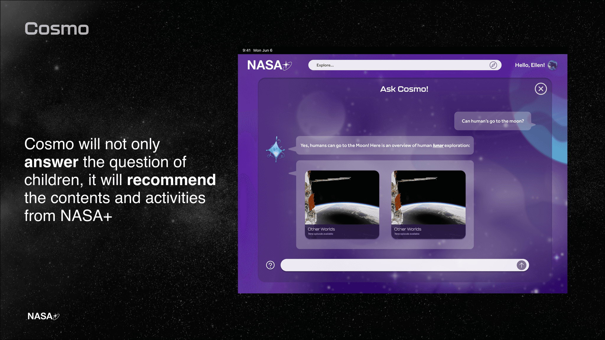
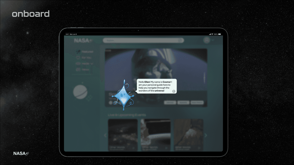
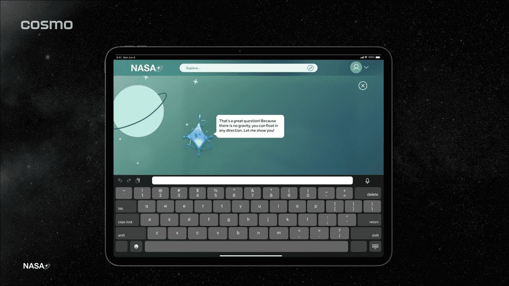
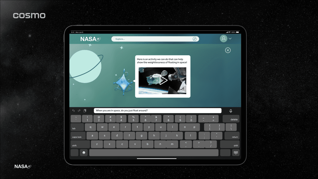
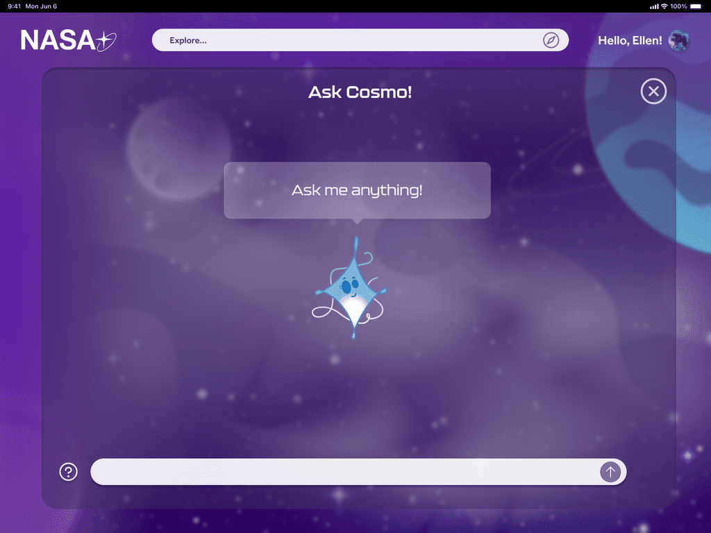
A conversational AI that is easily approachable, ready to answer any curiosity that children have about this world.
Final Design
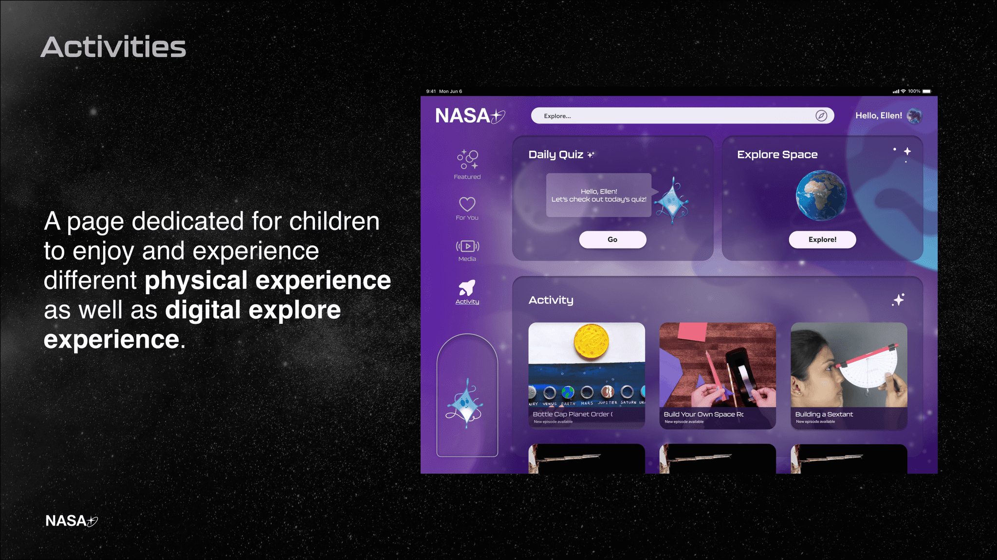
STEM Learning Activity
Leveraging the activities that NASA have developed, categorized clearly distinguished in different level.
Final Design
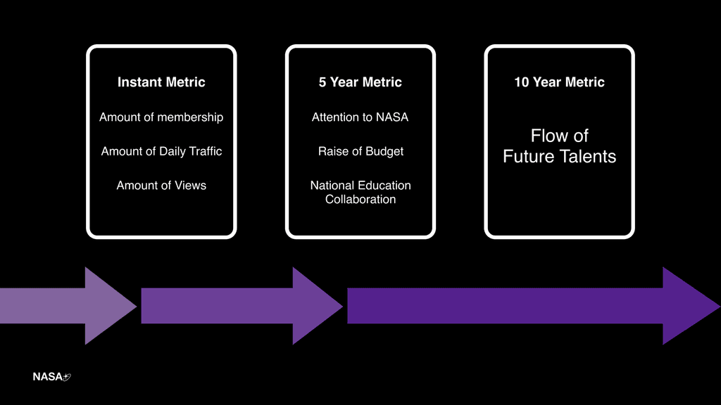
Key Performance Indicator
This will be the factors of how we are going to measure the performance and impact of NASA+.
Final Design
Vision Video


